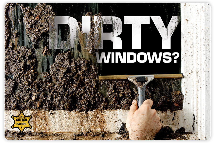
Gutter Patrol wanted a postcard mailer to help promote their window cleaning services. Since this is GoodEye Photography + Design, I put on both my photographer and design hats to come up with a concept that would attract attention and communicate the message. It took me a while to sell the husband & wife team on the idea of a really dirty window, but my years in advertising experience have proven that sometimes you have to go extreme to get noticed. I was pretty sure no other window-washing companies were doing anything like this, so I felt good that the idea was new, if not unusual.
Eric Branecki, the owner, spent the day before packing the window with dirt and pebbles. When I got there, he asked me what I thought – it basically looked too dang neat, like it was a perfect wall of dirt. I needed it to be a little more organic and chaotic. It’s tough because it’s obvious that someone’s house windows would never ever get this dirty to begin with (unless you were in a hurricane), but it had to look a little more realistic.
I had Eric hose down the window some until it looked more “realistic.” I knew I wanted to put the main tagline on the clean section of the window, but I was able to do some nifty Photoshoppin’ to make it look like the “Dirty Windows?” is just inside the house with the mud and streaks casting a shadow onto it. The result is a highly textured, graphical image that definitely stands out of the crowd.
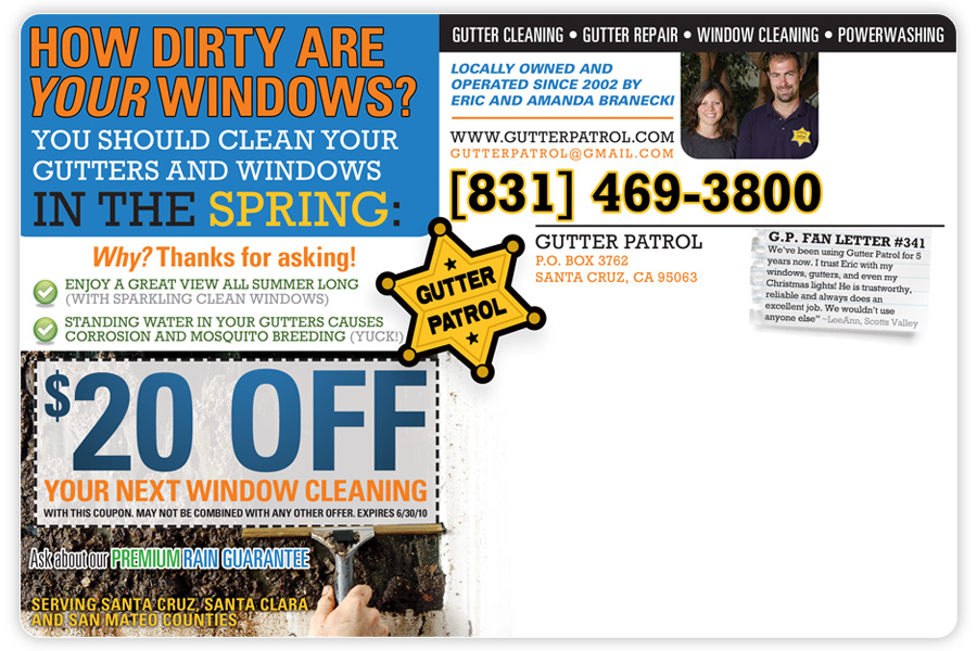
The rear design was inspired by the previous designer’s work (CJ Design), but completely recreated from scratch and branded with the window cleaning message. It’s a little on the busy side, but there’s a lot of info to communicate. By the way, how are your windows and gutters? Give Eric & Amanda a call to schedule an appointment, or visit their website.


