I’m lucky enough to be in a position where I can both photograph and design magazine covers, but in the real world it typically doesn’t happen this way. Often the magazine art director (AD) isn’t even involved in the shoot – they simply receive the end result and need to “make it work.”
When I wear my photographer hat, my natural inclination is to get nice, tight shots of a subject – to save myself from having to crop later. However, when the art director receives these files, he or she is left with little room to work with, potentially having to either force a re-shoot or simply end with a less-than-ideal cover. Here’s the limiting factors or barriers that can arise between the photographer and the AD:
- Camera vs. Magazine Proportions
- In-Camera Cropping vs. Magazine Bleed Requirements
- Including Negative Space
- Variety / Options
In this article, I’ll discuss these potential barriers and how they can be avoided in the photographer –> art director workflow.
Camera vs. Magazine Proportions
 Most photos produced by digital SLRs have a length to width ratio of approximately 2:3 – or 4×6, like the common print size. Although magazines vary widely in dimension, they tend to be closer to square than this wide rectangle proportion. If you’re into TV, allow me this analogy – cameras create a “widescreen HD” image but magazines tend to be more “standard def.” But instead of the infamous black bars, photos going on magazine covers are going to be seriously cropped!
What’s this mean to the photographer? You have to zoom out, my friends. Imagine the top and bottom of the image in your frame getting completely lopped off, so all your relevant content needs to be within that inner 4:5 ratio area. It feels really unnatural and uncreative from the photography standpoint, but trust me you’ll stay on the AD’s Christmas Card list if you follow these simple tips!
Not only do you need to consider the top and bottom areas being cropped off, but you need to allow even MORE space for the magazine trim (bleed area) and coverlines, which I’ll get to next.
In-Camera Cropping vs. Magazine Bleed Requirements
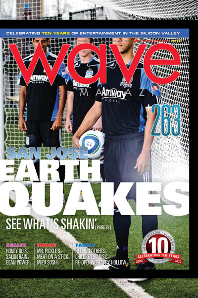
As you can see on the image to the right, pasting the original photo into the layout reveals how much is getting cut off on the top/bottom once the image is scaled to match the width of the cover.
The black bar shows the magazine’s “bleed” area – the part that will get trimmed off by the printer. Any photo/graphics that extend to the trim edge need to actually extend past this edge to avoid blank white paper showing along the edges in the final product. The bleed area on this particular magazine is pretty big (3/8″), but it’s typically about 1/8″ for most print media.
Even though I shot this photo, I didn’t allow myself enough headroom (literally!) for all the shots – it’s very challenging to envision the final product, especially when you’re crunched on time (I only had 20 minutes with the players for this shoot!). So as a photographer, you have this crazy pressure to be creative, get the lighting perfect, interact with your subject(s) to get them to relax, AND think about how the stupid AD is going to lay out the final magazine cover… it can be challenging to say the least!
To make this particular shot work as a cover mockup I (with my AD hat on) had to scale the image UP and crop the foreground player (Jason Hernandez) off at the knees. Sorry Jason, my bad. The photographer might get ticked that their “art” was cropped by the “designer,” but that’s the risk you run when not taking all the magazine factors to heart. Here’s the “fixed” layout below.

Including Negative Space
In a perfect world, your photos are SO good they grace the covers of national magazines without a single coverline covering them up. But let’s be realistic people – even National Geographic has to cover up their photos a little bit. A creative workaround is to include negative space in your compositions – areas for your eyes to rest (for photos), OR areas for type-crazy AD’s to fill up with copy (text). When I was shooting the shot in the mockup above, I was thinking about negative space, but not the overall cropping – so that nice open space I left on the green grass for coverlines was lost when I had to scale the image to fit the players correctly. Oh well, it’s the thought that counts, right? Wrong.
Luckily I had another shot of a single player, Andre Luiz, kicking the ball towards me (I had protection). I left lots of open room around the edges of the frame (for cropping), and was able to include some decent amount of negative space (for coverlines). Plus, it had action, which is always a nice dynamic addition to grab potential readers’ attention.

The background has some distracting elements in it, but this was the best option I had at Stanton Field, and I didn’t want the sun (camera right) to be in Andre’s eyes. You can see on the final cover that the photo cropped really well; I was able to keep Andre’s whole body on the page, and doing some selective cutouts added some nice depth/3-dimensionality to the overall design. The aforementioned distracting background elements were easily masked out. Because Andre takes up a relatively small area on the cover, I was able to put the main coverline behind him, but make it very large. The ball, the V of the logo, and Andre’s body/leg position form a nice triangle to lead the eye and keep your attention on the page. And lastly, I was able to keep some of that nice negative space, even after adding the coverlines, which eases the eye and immediately draws your attention to that floating soccer ball.
Variety / Options
Whenever you are shooting for a magazine cover, you need to consider the ratio and bleed of the magazine when choosing your photographic compositions. You need to include negative space around your subject for coverlines. Lastly you need to offer a variety of concepts for the AD to choose from. If you have 20 minutes to shoot (see the 38 photos from my shoot with the San Jose Earthquakes here), make sure you’ve already set up your lighting for the first concept before anyone arrives – use an assistant or innocent bystander as a temporary subject to dial in all your settings. This will maximize the time you have with your subject as well as communicate to everyone involved that you’re on top of things and are a true professional.
Force yourself to change the shoot before you run out of time – to try another idea. If you work smart and are prepared, use any extra time to do something off-the-wall or unexpected. Getting the main concepts out of the way will not only boost your confidence, but it gives you the opportunity to really flex your creative muscle, without the stress that forces you into cookie-cutter, tried-and-true (see: boring) solutions. You never know, something crazy from the very end of your shoot may actually work and end up on the cover – you never know.
Regardless, giving your AD options, and a variety of compositions, angles, etc. will make their job easier, and make it more likely you’ll be called back for future work, which is kinda the point of all this, right? Right. Thanks for reading.

